
A year ago in iOS 14, Apple first provided the ability to add widgets to the iPhone home screen. It’s a nice feature that I use every day, but I am only willing to devote a limited portion of my first iPhone home screen to widgets because I want to also have space for my frequently-used apps. On the other hand, screen real estate is a completely different story on the iPad. Now that iPadOS 15 allows the placement of widgets on the iPad, I find myself using a different approach to widgets: only widgets on the home screen.
There are two reasons that this works so well for me. First, and most obviously, there is a lot more space on the iPad screen. Thus, when you are deciding where to place your widgets, you have a larger canvas to work with.
Second, you can devote more – and perhaps all — of that larger canvas on an iPad to widgets because the Dock on the iPad is considerably longer that the iPhone. The iPhone’s dock only has space for four apps. The iPad dock has space for up to 20 apps — although, depending upon your your setup, you may pick just 17 of those. In the Settings app, you can turn on the option to show up to three suggested and recent apps in the Dock, which leaves you room for 17 apps in the Dock that you select, plus three recent ones. But whether you pick all 20 or just 17 of the 20, the iPad dock unquestionably holds far more apps that the iPhone dock.
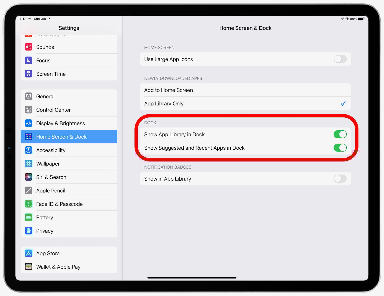
There’s actually room for one more thing in the Dock. Another option in the Settings app is to add one more space at the far right end for the App Library, which means 21 different slots in the Dock, if you turn that on.
The upshot of all of this is that I don’t need to place apps on my iPad’s first home screen. The 17 most important apps are in the Dock, the last three apps that I used other than those 17 are also in the Dock, and the App Library at the end of my Dock makes it easy to find other apps. With no need for apps on the first home screen, I get to devote all of that space to widgets.
Having only widgets on a home screen changes the home screen from an app launcher to a mission control, displaying the key information that I need for getting my work done and other valuable information. Indeed, a good widget is so useful at displaying information that you may not need to even launch the app to learn more. And everything is visible with just a quick glance.
Here are the widgets that I currently find the most useful on my iPad.
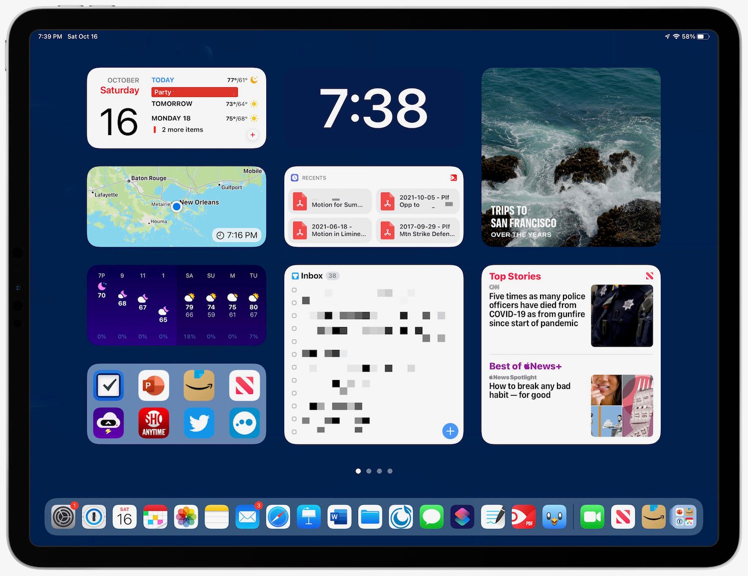
I’m going to start with my center column because it is probably the most useful. At the top, I have the time displayed — using big, bold numbers that are obvious at a quick glance. The app that I’m using to display the time is Widgetsmith because it allows almost infinite customization. I’m using a medium size widget, and I’ve customized that widget to display only the time, using large white numbers on a blue background that matches the color of the iPad background. Thus, instead of looking like a rectangular widget, it looks like the time is being displayed directly on the iPad’s background.

Just below the time, I have a medium size widget from PDF Expert, the app that I use to work with PDF files, displaying my four most recent files. When I want to launch PDF Expert, there is a good chance that I’m going to want to look at one of those recent files, and by tapping one of those four buttons in the widget I can jump directly to that file. It’s a great shortcut.
At the bottom of the middle column I have the large widget from Things, the app that I use to keep track of my to do list. In the above image, I’ve pixelated the widget to redact confidential information. But on my iPad, it displays the top 12 items that I need to be working on. Thus, without even launching the Things app, I can see the most important items for me to be working on today. When I’m ready to mark an item as completed, I just tap on the widget to launch the Things app. As a result, I don’t even have the Things app on my Dock (unless it shows up as one of the three most recently-used apps) because the widget itself launches the app.
So in short, the middle column shows me what I need to be working on, gives me a link to documents that are often relevant to that work, and reminds me of how much time I have to complete that work because of the clock. It’s a column of productivity.
At the top of my left column I have a medium widget from Fantastical. The left side of the widget tells me the day and date. Yes, that information is also at the very top of my iPad, but it is in a small font size. The Fantastical app makes it much easier to see today’s date at a glance. The right side of the Fantastical widget displays the next two or three items on my calendar, reminding me of upcoming meetings.
The next two medium widgets in my left column are from CARROT Weather. One displays a radar so that I can quickly see rain in the area (a premium feature of the app that I get by paying for a subscription), and the one below it displays the hourly and daily forecast. if CARROT Weather had a single large widget that included all of that information, I would use that instead, but using two medium widgets also works fine and give me the weather that I find most useful.
At the bottom of my left column is the Siri Suggestion widget with eight app suggestions. If I want to launch an app and it isn’t in my Dock, I will often see it there. If not, I can swipe to my second home screen, which displays my top apps that were not placed in my Dock, or I can tap the App Library at the end of my Dock, or I can swipe down on the screen to search for an app. To be honest, though, I’m not sure if I will stick with the Siri Suggestion widget because I only use it occasionally. I previously had the Notes widget in that location, giving me quick access to my three most recent notes, and I may return to that.
The top half of my right column is the large Photos widget displaying For You photographs. This is one of my favorite widgets because it changes frequently throughout the day. I never know what I am going to see there, but it is often a picture that makes me smile. It reminds me of having a traditional framed photograph on my desk, but it is much better because the picture changes all of the time. If I tap the widget, it starts a short movie using the Memories feature in Photos so that I can see that photo and related ones. I have a large number of pictures in the Photos app, and the Memories feature in general, and this widget in particular, do a great job of resurfacing pictures. I love it.
The bottom half of my right column is the large Apple News widget set to Today, which means that it shows me two news headlines. I’m often too busy during the day at work to pay much attention to the news, but any big story of the day is going to be in the Apple News widget. Thus, just by glancing at my home screen, I have some sense of what is going on in the world, and I can tap on the headline if I want to read more. (As an Apple One subscriber, I get access to Apple News+, but even without a News+ subscription you can read much of the top news in the Apple News app.)
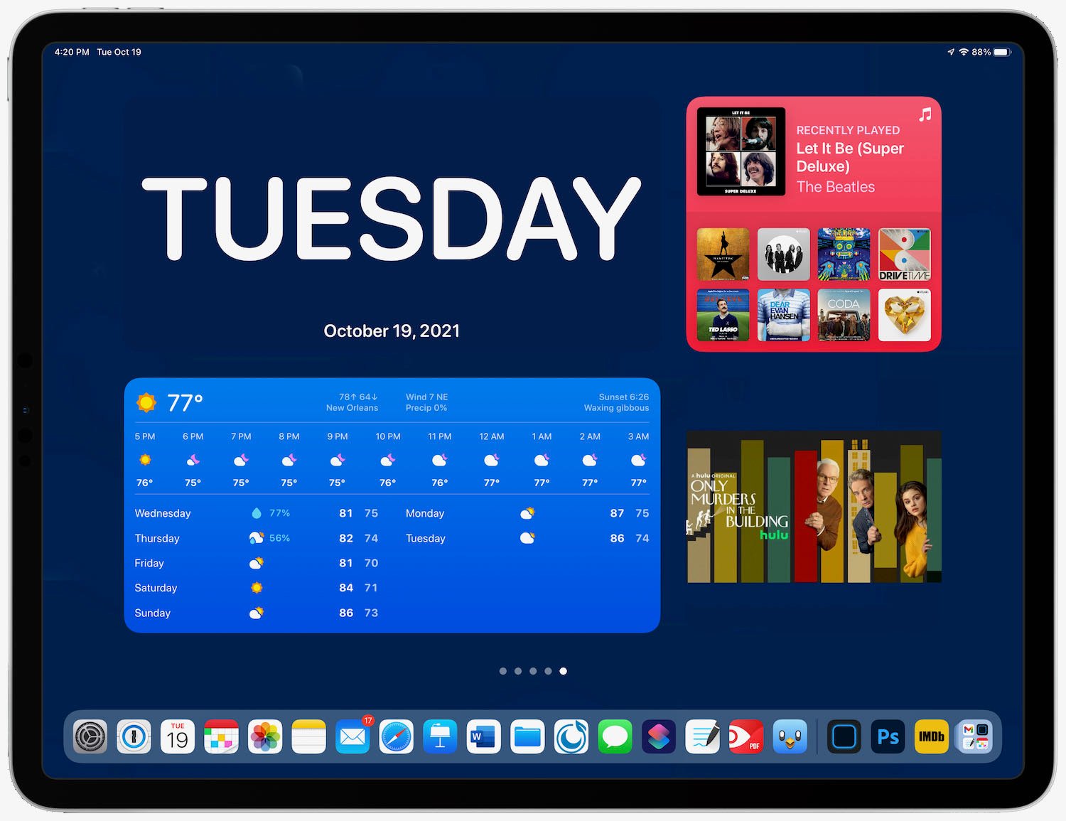
iPadOS 15 also supports a new XL size widget, the size of two large widgets. It is impressive that so much information can be displayed in this widget size. So far, I don’t consider any one widget valuable enough to occupy this much space on my first home screen, but I do have some of these on my subsequent home screens. To be honest, though, they are really just there for fun. You have to really love a widget to let it take up that much screen space.
As more apps release better widgets for the iPad, I may replace some of the widgets mentioned above with other widgets that work better for me. But at this point, I see no reason to ever go back to having app icons on my iPads’s first home screen. A screen with all widgets is just so better for me thanks to the additional information it displays. I encourage you to try it yourself so that you can see if you find it to be as much of an improvement as I do.